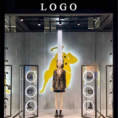
Summer is almost halfway through, and many customers are starting to feel weak in the face of summer discounts, and now this time period should be almost the time for autumn to be new, so the autumn window design cannot be slowed down. This is not a small editor today to help you summarize the design inspiration of autumn and winter windows, so that you can win at the starting line!
Many people think that the thing of popular color is only related to clothing, then it is very wrong!! Who said that popular colors are only related to clothing, and those of us who do store vision are inseparable from popular colors?! Clothing should keep up with the trend, and of course, the store vision must keep up with the trend~
I once read a phrase that I like to describe the window: the story in the window can be played out for the entire four seasons, from spring to silver.
1. Orange
As the best way to directly display products and promote brand image, choosing the right color is the focus of the key. In this autumn period, it is the right choice of orange, because orange is bright and gentle, with a gentle light and a slight warmth. It is as if the orange color of the forest surface speaks of the gentleness of the earth, and the words are bright. And orange seems to be a color tailored for autumn.
Orange background added to orange products, the same color of strong window design, but also to customers to bring a strong visual impact, plus deepen customers' understanding of the product.
2. Vibrant yellow
Yellow, as a complementary color of orange, always gives people an infinite sense of vitality, not only orange, but also blue and red can produce a strong visual impact~
Yellow and other highly saturated colors collide to create a vivid visual effect that adds some warmth, but refreshing warmth, to autumn.
When yellow is used as a window background, it reflects the personality and vitality of the product, so not all brands are suitable for choosing yellow, which is more suitable for young brands. It is still necessary to combine your own brand image and product characteristics to choose the autumn window theme, and you cannot blindly follow the trend.
The childlike yellow window makes the product also have vitality and attracts customers into the store.
The rotating color wheel not only increases the visual attention of customers, but also increases the fun and decoration of the window...
Fall is also an important topic of the beginning of school, so many brands can use yellow as a back-to-school theme window in the fall.
3. Jin Cancan
We just said that warm colors such as orange and yellow are suitable colors for autumn windows, so gold is the exclusive color of autumn. The golden wheat field represents this harvest, and the autumn sun is always golden but not so dazzling. If your brand is understated and connotative, then choosing gold as the autumn window color is safe.
Due to the low temperature in autumn and winter, warm gold should be used to create a warm atmosphere for the window, increase the saturation of goods, make it look more affinity, softer, and customers have the urge to buy~
4. Deciduous color
In the design of autumn windows, Xiaobian should emphasize a display method, using fallen leaves for window design, and using the display of theme scenes to reflect the feeling of autumn.
Sunglasses transform into a person with a broom to sweep away fallen leaves, and the whole window becomes interesting and creates a strong autumn feeling.